WHAT IS IT
Typography is the art and technique of arranging letters and characters known as type.
A BIT OF HISTORY
1000B.C
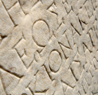
Phoenicians created the very first alphabet and around 1000 B.C. The same alphabet was used by the Greeks. In fact, the word Alphabet is a combination of the first two Greek letters, Alpha and Beta.
1440
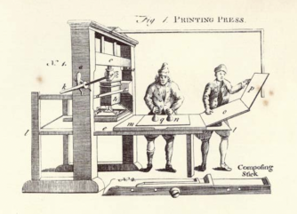
Johannes Gutenberg invented the printing press in Germany.
1772
Englishman, William Caslon created the Caslon typeface. It was widely popular in England and America. Caslon was the font used for the declaration of Independence.
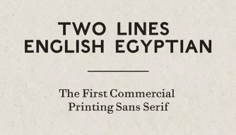
1816
William Caslon’s great-grandson, William Caslon IV, is credited with creating the first sans serif. It was an all capital typeface that he called Egyptian.
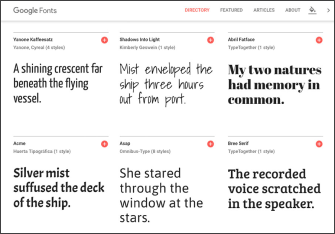
2010
Google launched its library of webfonts, called Google Fonts. The fonts are open source, meaning they are free to everyone. This innovation allowed more fonts to be Viewable on the web, making the internet a more beautiful and legible “place”.
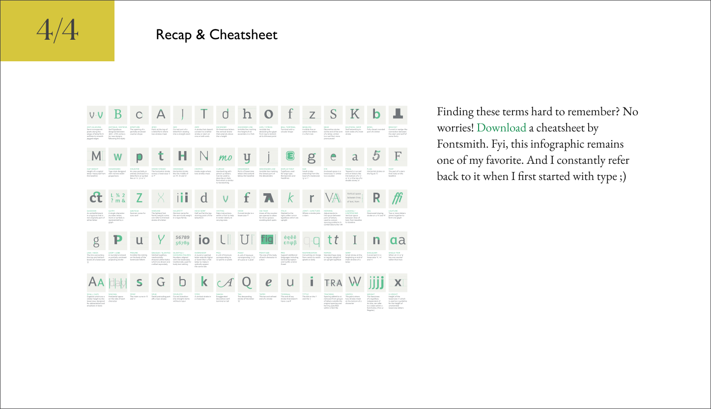
basic terminologies
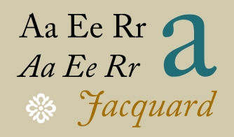
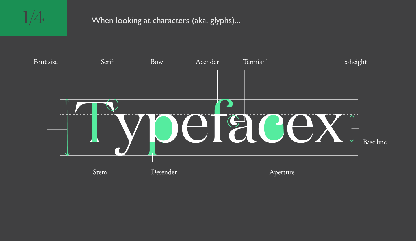
A typeface is the design of lettering that can include variations in size, weight (bold), slope (italic), width (condensed), and so on. Each of these variations of the typeface is a font.
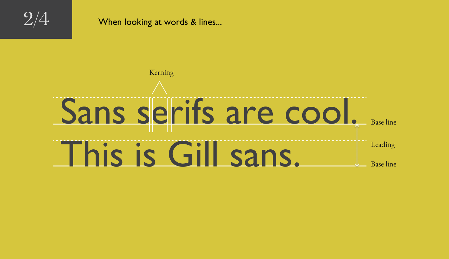
In typography, a serif is a small line or stroke regularly attached to the end of a larger stroke in a letter or symbol within a particular font or family of fonts. A typeface or "font family" making use of serifs is called a serif typeface, and a typeface that does not include them is sans-serif.
A monospaced font, also called a fixed-pitch, fixed-width, or non-proportional font, is a font whose letters and characters each occupy the same amount of horizontal space. Monospaced fonts are customary on typewriters and for typesetting computer code.
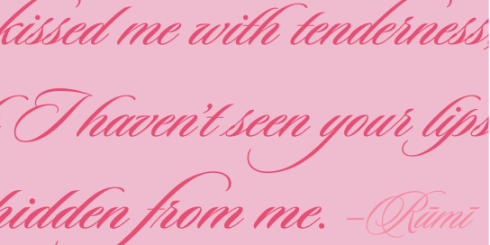
Script typefaces are based upon the varied and often fluid stroke created by handwriting. They are generally used for display or trade printing, rather than for extended body text.
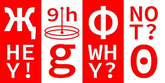
They are intended for use at large sizes for headings, rather than for extended passages of body text. They may take inspiration from other genres of lettering, perhaps ornamented, exotic, abstracted or drawn in the style of a different writing system.
last but not least...
some PRATICAL TIPS!
"Look after goodness and truth, beauty will look after herself."
—— Eric Gill, An Essay on Typography
Using two different fonts successfully in a layout is hard. It requires an in-depth understanding of the essence in type or an enormous portion of luck. In general, a good rule of thumb is, to avoid two typefaces that look similar to each other and have the same classification.
2.Get used to ~5 fonts and stick to them.If you are always in the veld, chasing your next .tff download, you potentially forget about the important things in life: creating stuff.
3.Double your point sizeWhen you start with Web or Interface Design it’s often difficult to determine the font size of headlines, subheadlines, and body text. Yes, you can indeed use your gut feeling, but especially at the beginning, you should follow this simple rule: Always double your point size.
If you want to have a striking headline and some decent body text, try to format the headline in Bold and the body in Light or even thin of it’s still readable and the font family is offering you the possibility. The reason behind that is visual contrast.
5.Mind the space in your compositionWhen in doubt, try to let your layout “breathe” a little by reducing the number of things going on at your canvas. If you stuck in your design process, duplicate the artboard and attempt to reduce a certain section of your composition by half and look at the result.